AI recruiting app
Challenge
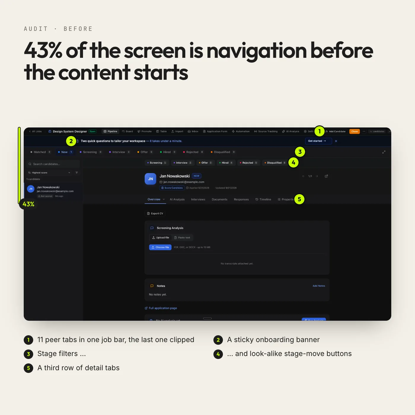
The client was building a recruiting app (ATS) in which AI scores candidates and builds a shortlist. The prototype had plenty of features, but it showed all of them at once, at the same visual weight, and the same thing went by several names.
On the candidate screen, navigation took up 43% of the height before the content started. A job had 11 peer tabs, and stage filters looked exactly like the buttons that move a candidate to the next stage, so it was easy to move someone by mistake.
What we did
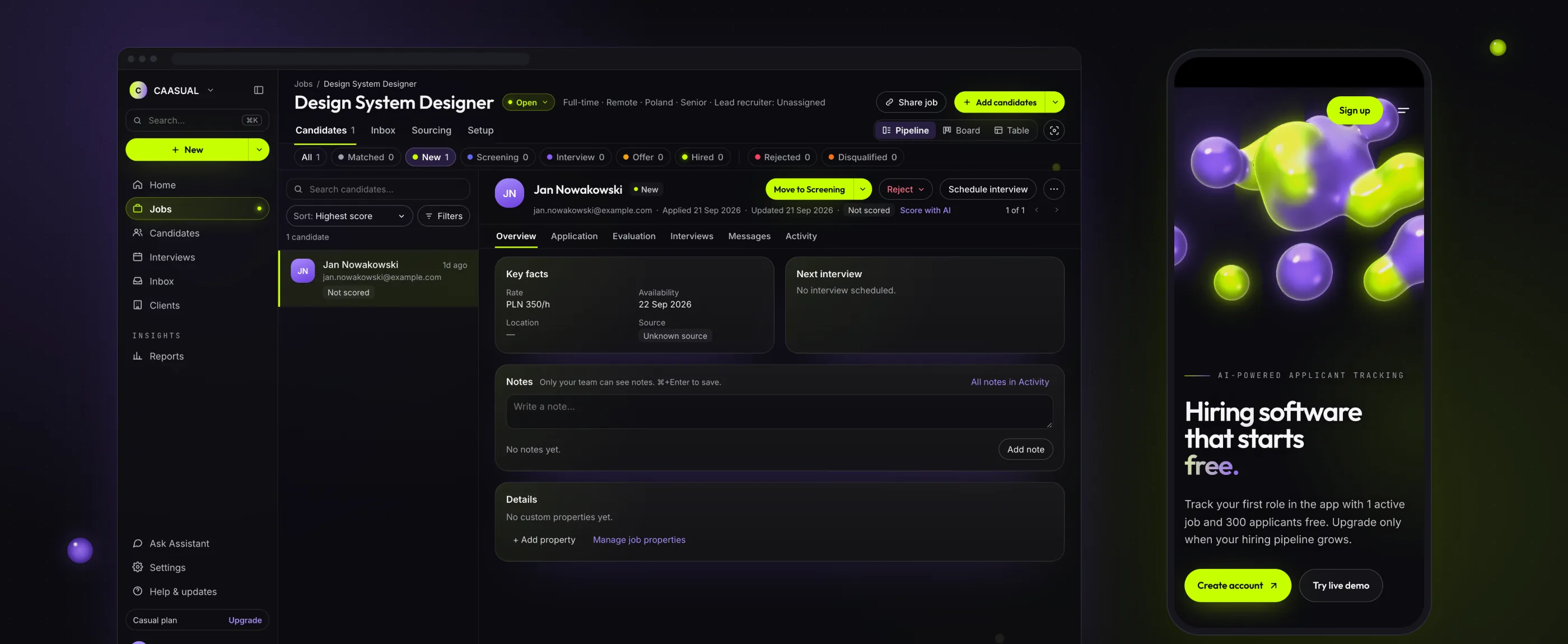
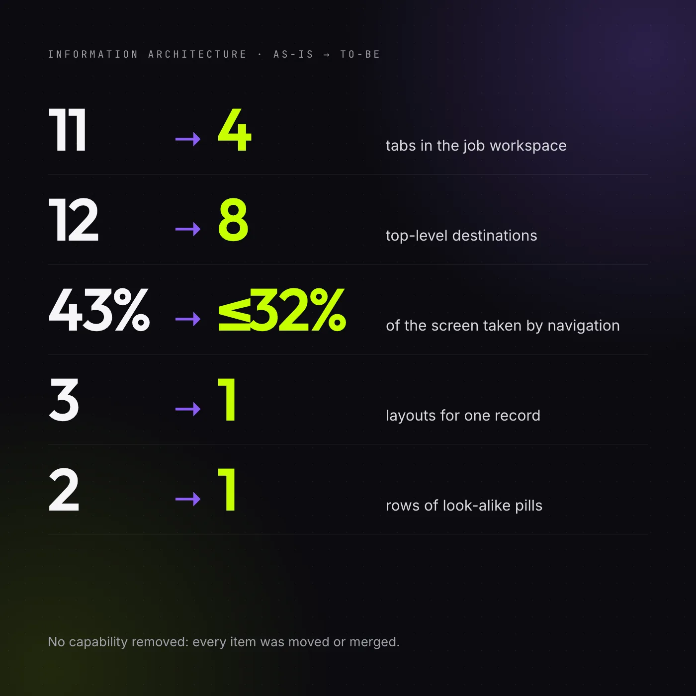
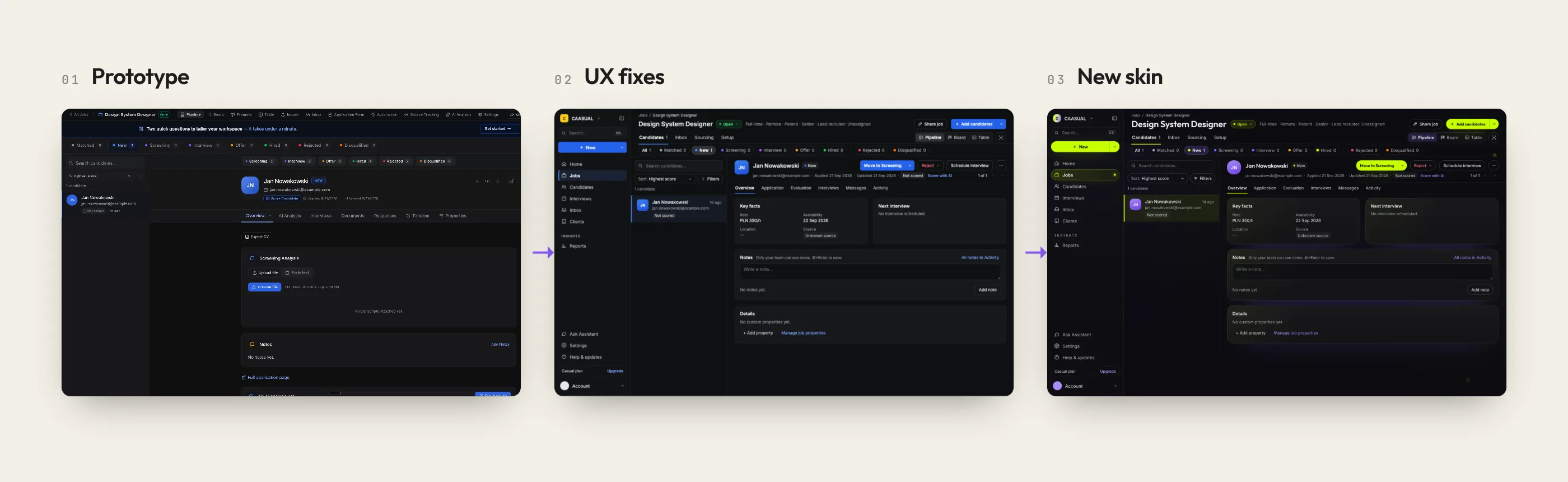
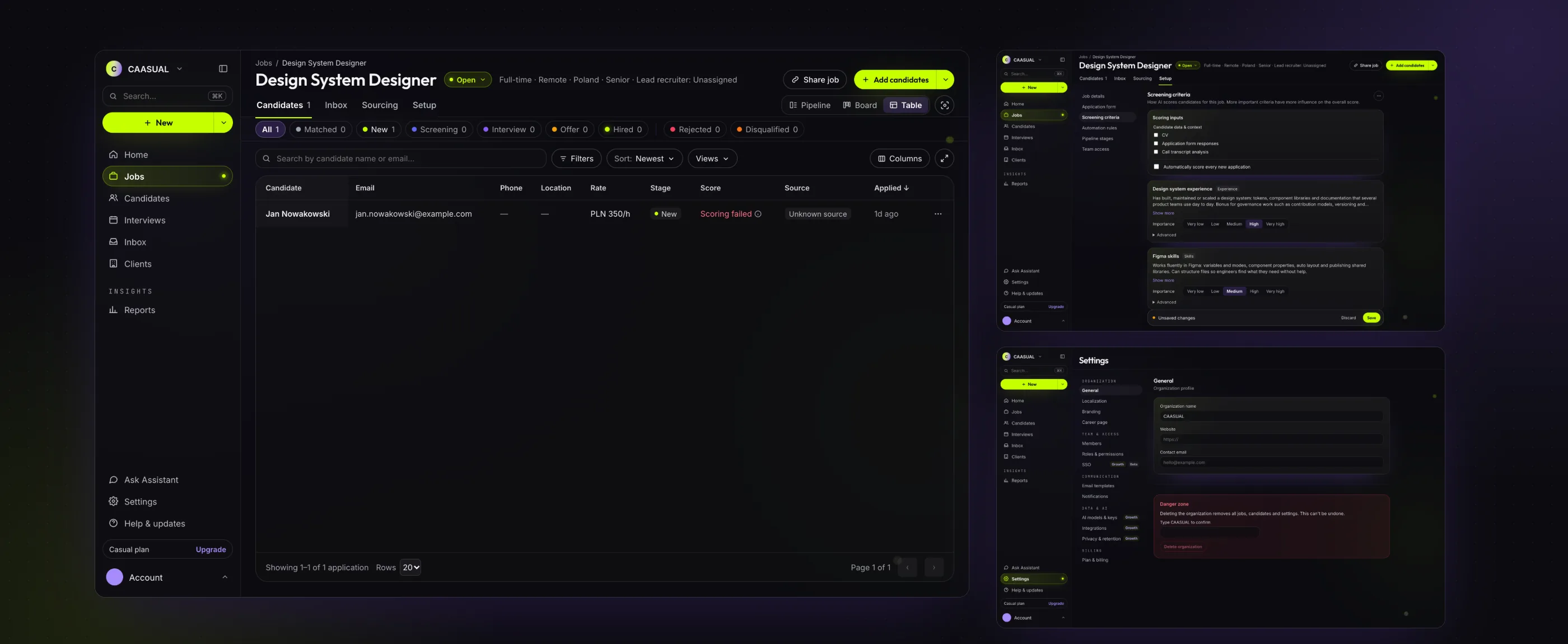
We started with a UX/UI audit: we went through every view, menu and filter of the prototype and ranked the problems by severity, using Nielsen Norman Group guidelines. We proposed a new information architecture: a persistent sidebar, 4 job tabs instead of 11, one layout for application details and one shared vocabulary.
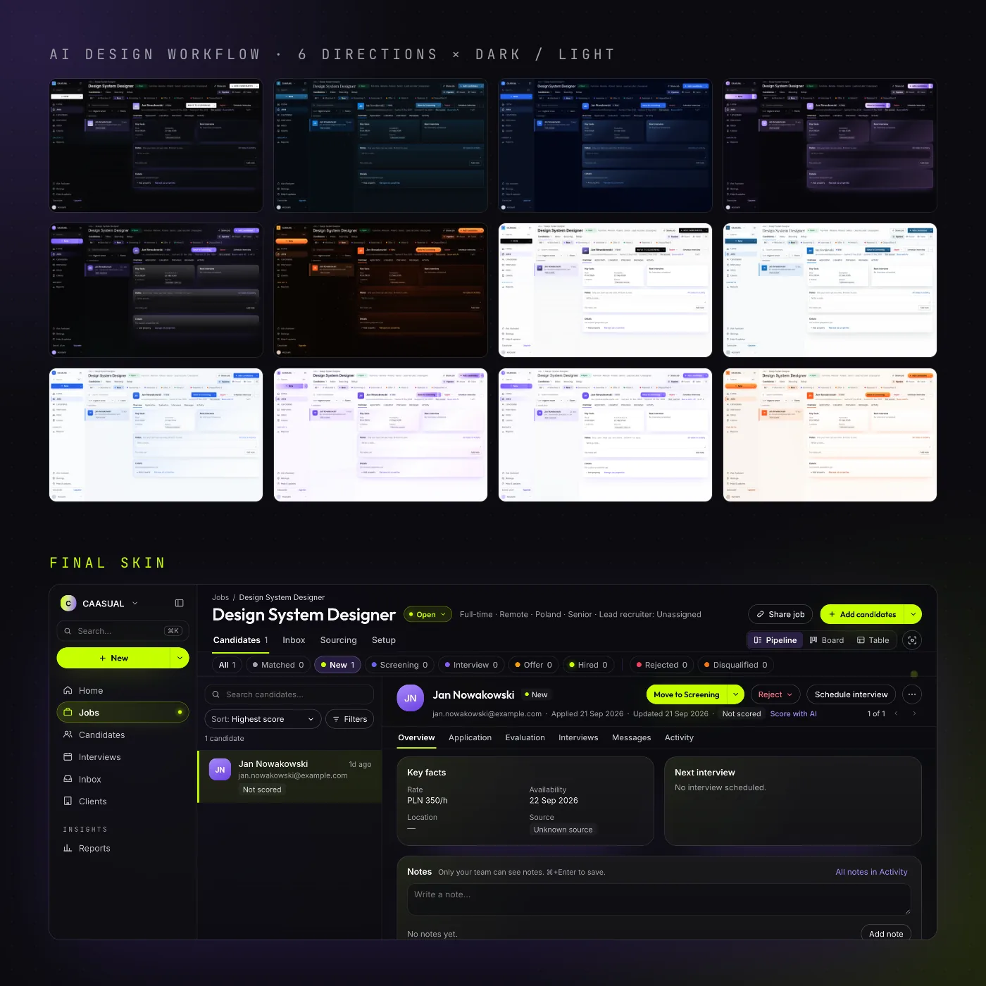
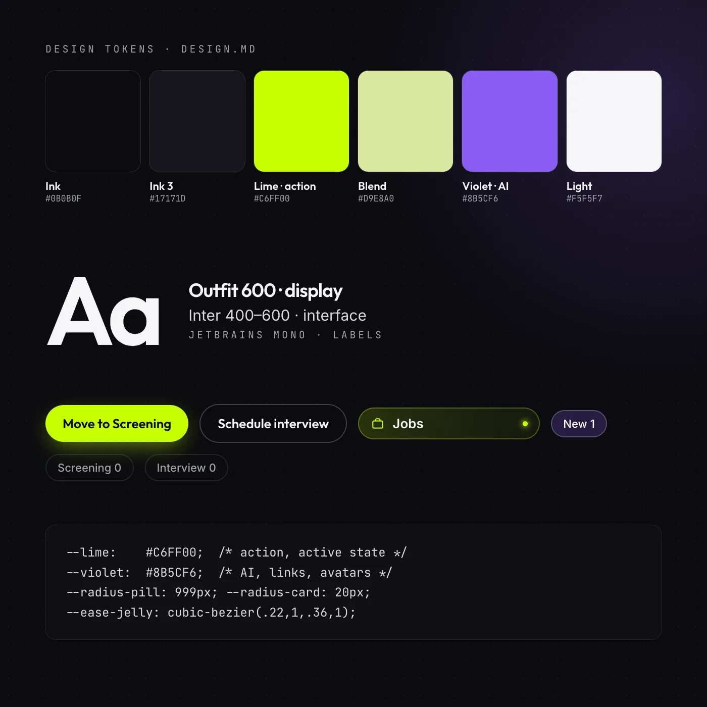
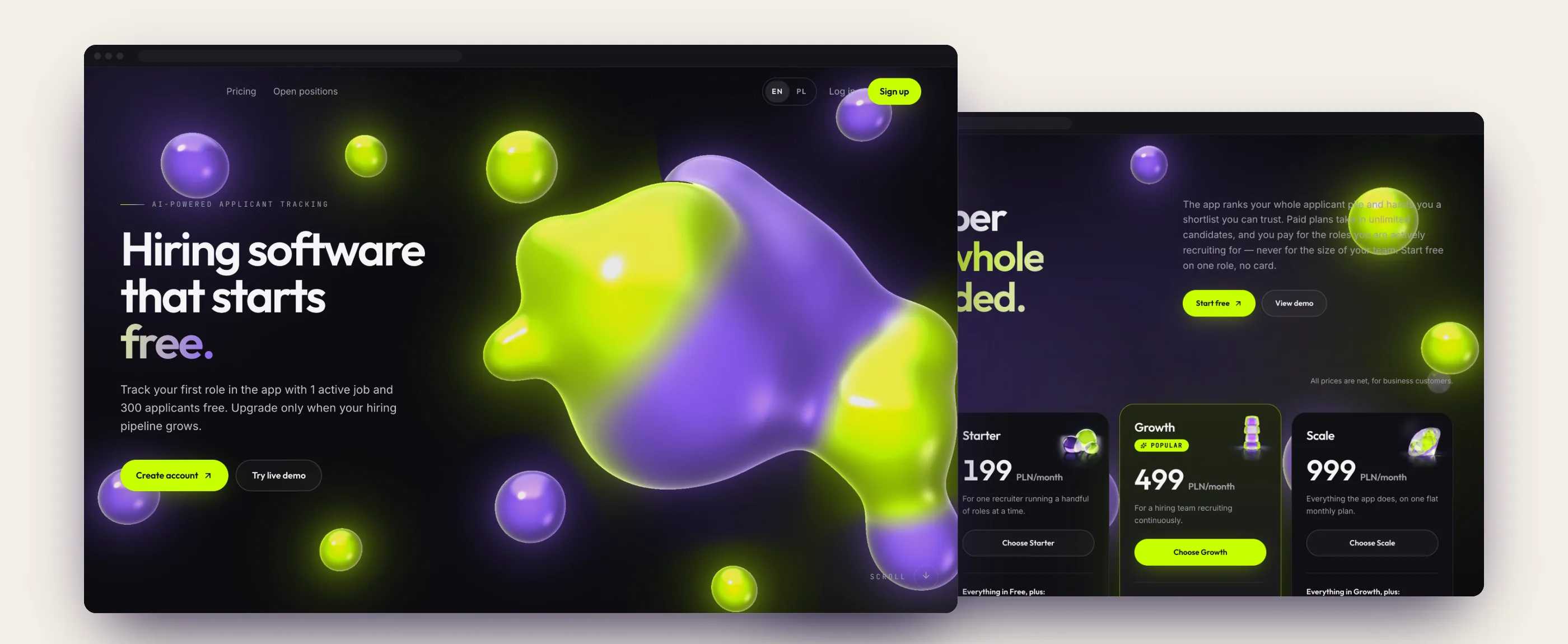
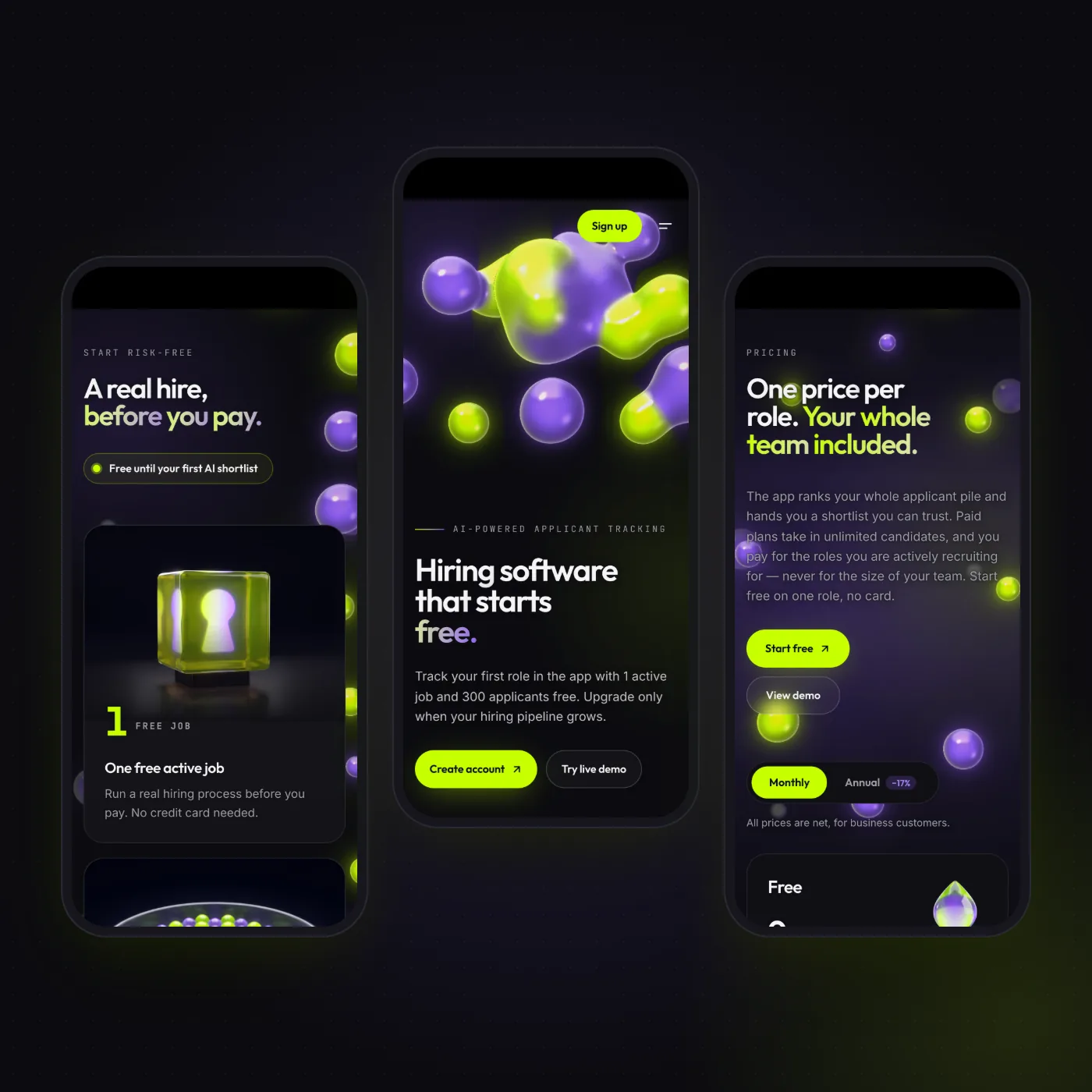
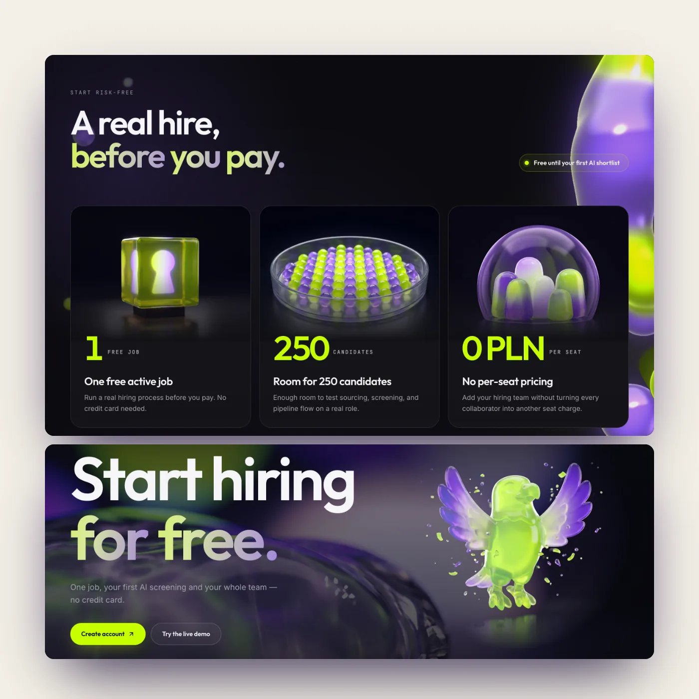
We delivered the fixes as rules and prompts for AI, used by both the designers and the client’s developers. In the same AI design workflow we tried 6 visual directions, each in a dark and a light version, on the same 16 screens. Each direction is a DESIGN.md file with tokens. The chosen skin builds on the identity of the landing page we designed for the product.
Result
The team got 16 redesigned screens and one token file that both people and AI agents understand. The menu went from 12 to 8 items, job tabs from 11 to 4, and navigation takes up at most 32% of the screen. No feature was removed: each one was moved or merged with another.