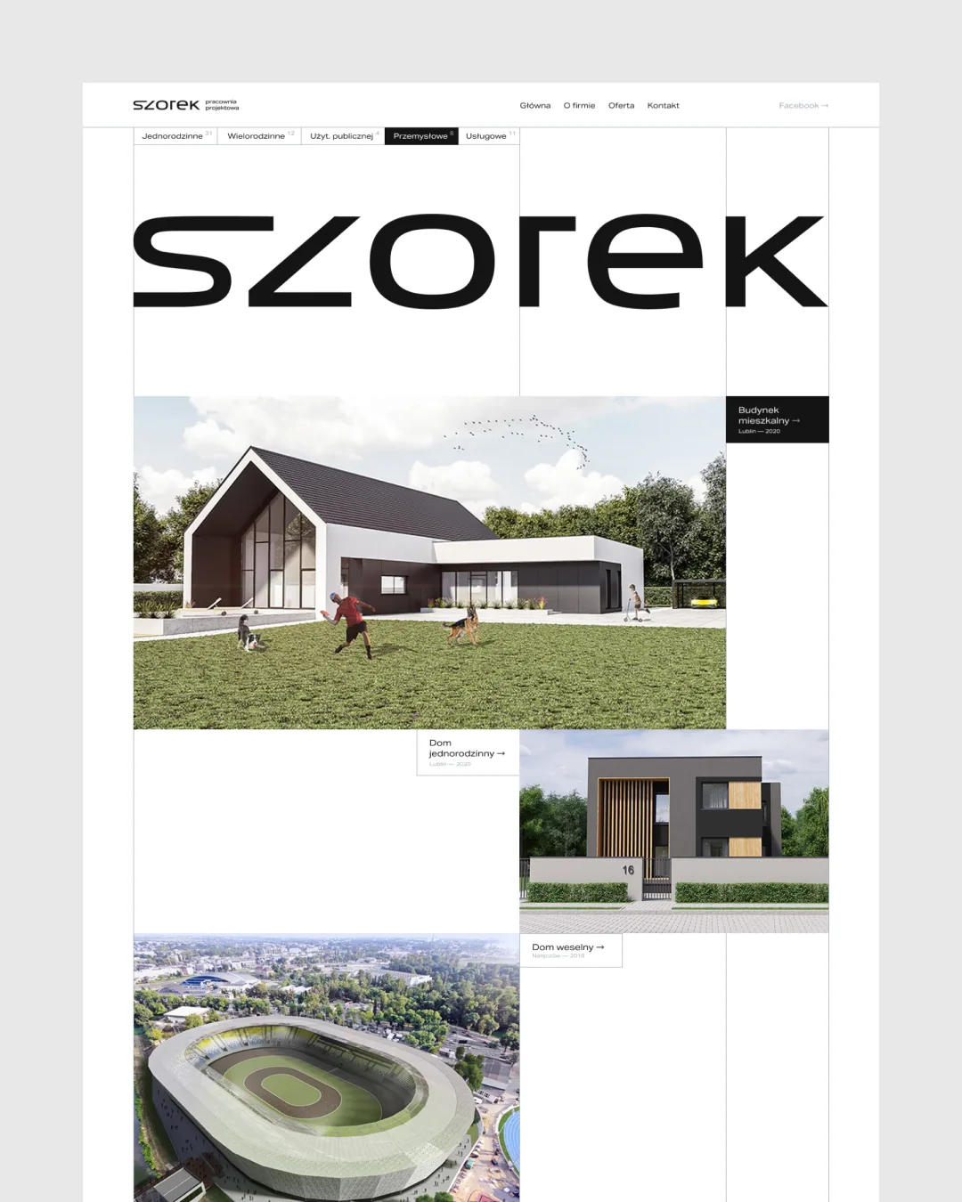
SZOREK Architecture Design
Challenge
SZOREK is an architecture studio from Lublin, Poland, that designs residential, commercial and public buildings end to end. While its portfolio showcased outstanding technical skill, its previous identity lacked the sophistication to reflect the studio’s class.
The rebrand coincided with a shift in the studio’s services and in the clients it wants to reach. The brand had to speak to them in today’s language, grounded in who those clients are, what the market looks like and what competitors do.
What we did
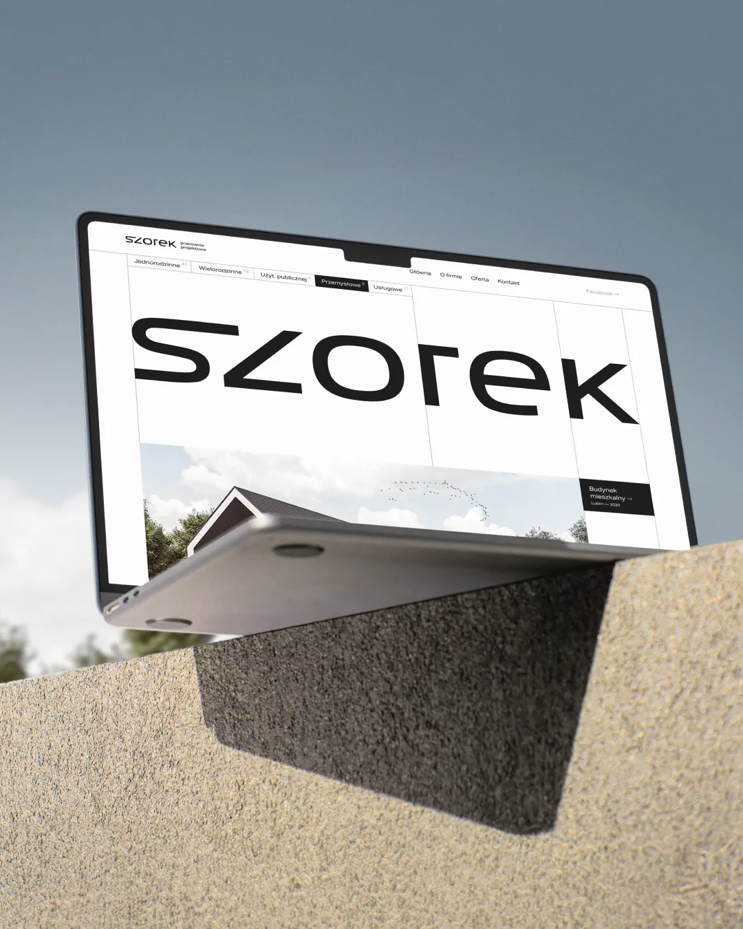
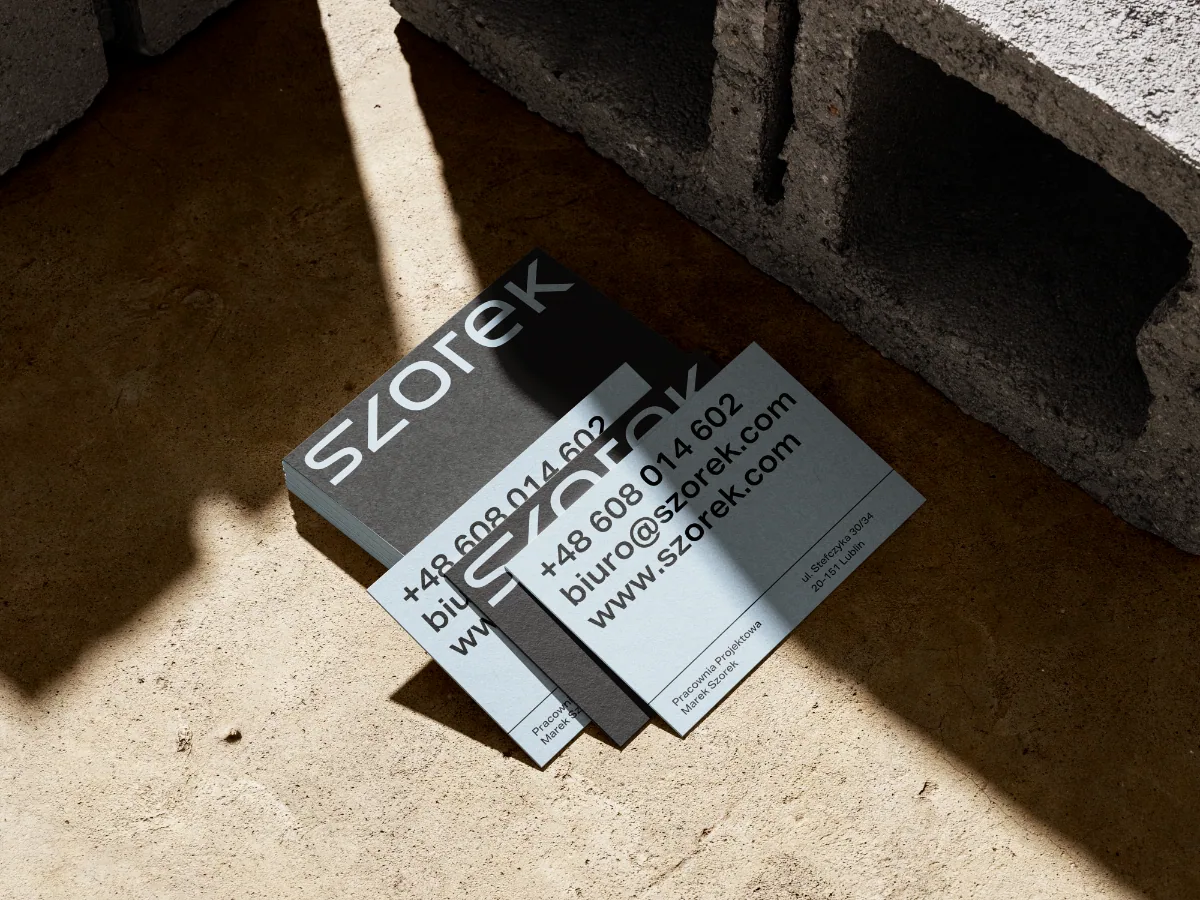
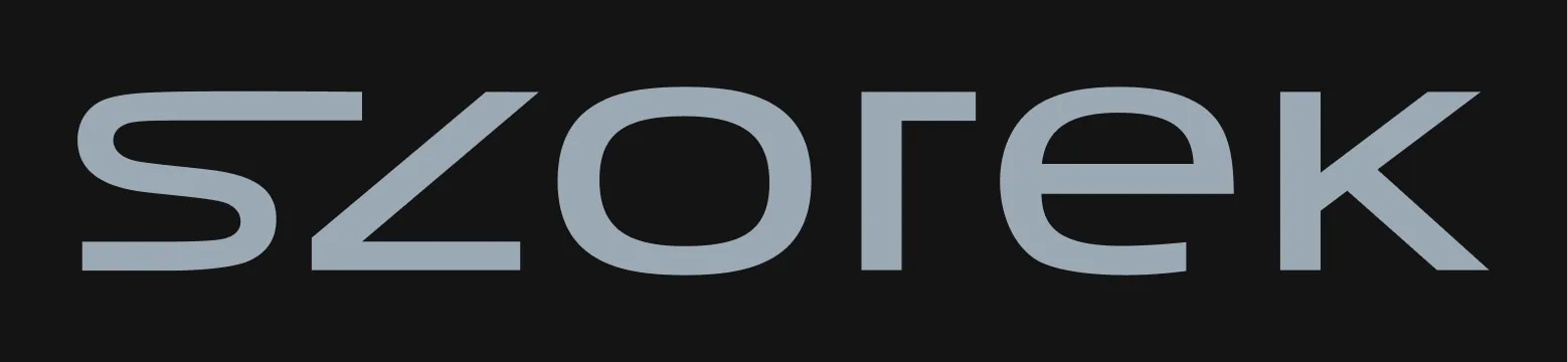
We carried out a strategic brand refresh. In the logotype, we replaced rounded letterforms with a more technical, precise geometry that better reflects the rigour of architectural drawing and engineering. The new palette builds on the industry standard of black and white but introduces a distinctive cement-blue grey. This subtle yet deliberate departure sets the studio apart and directly references building materials and brutalist aesthetics.
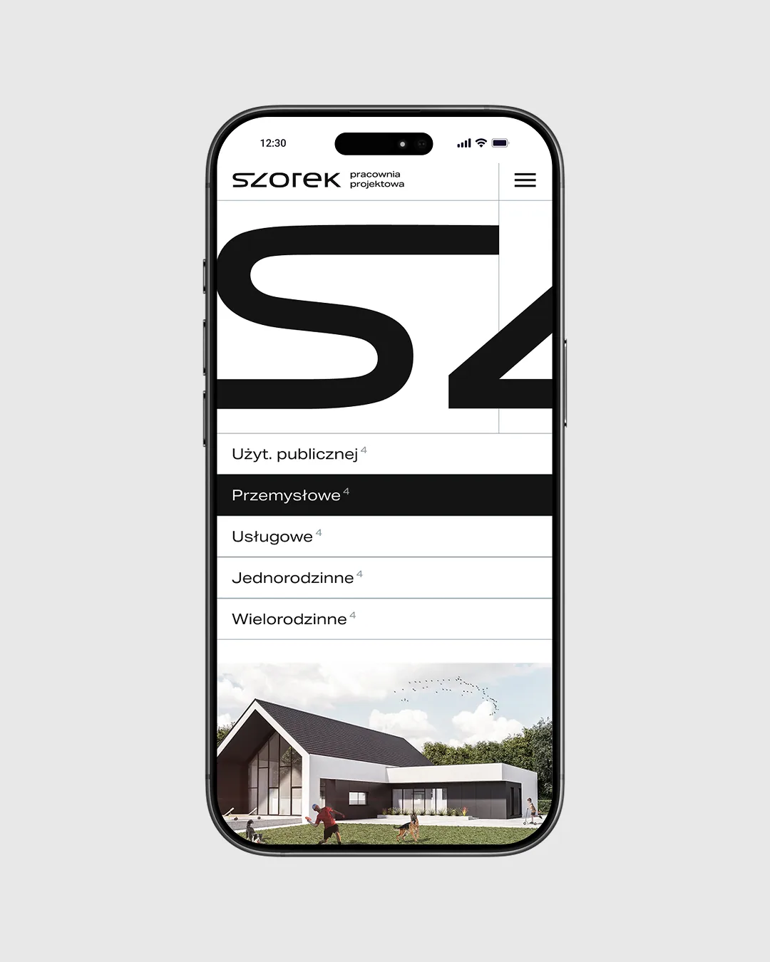
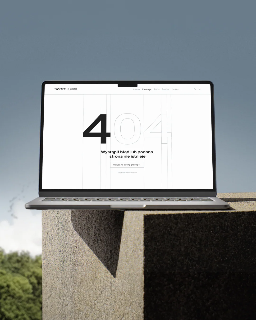
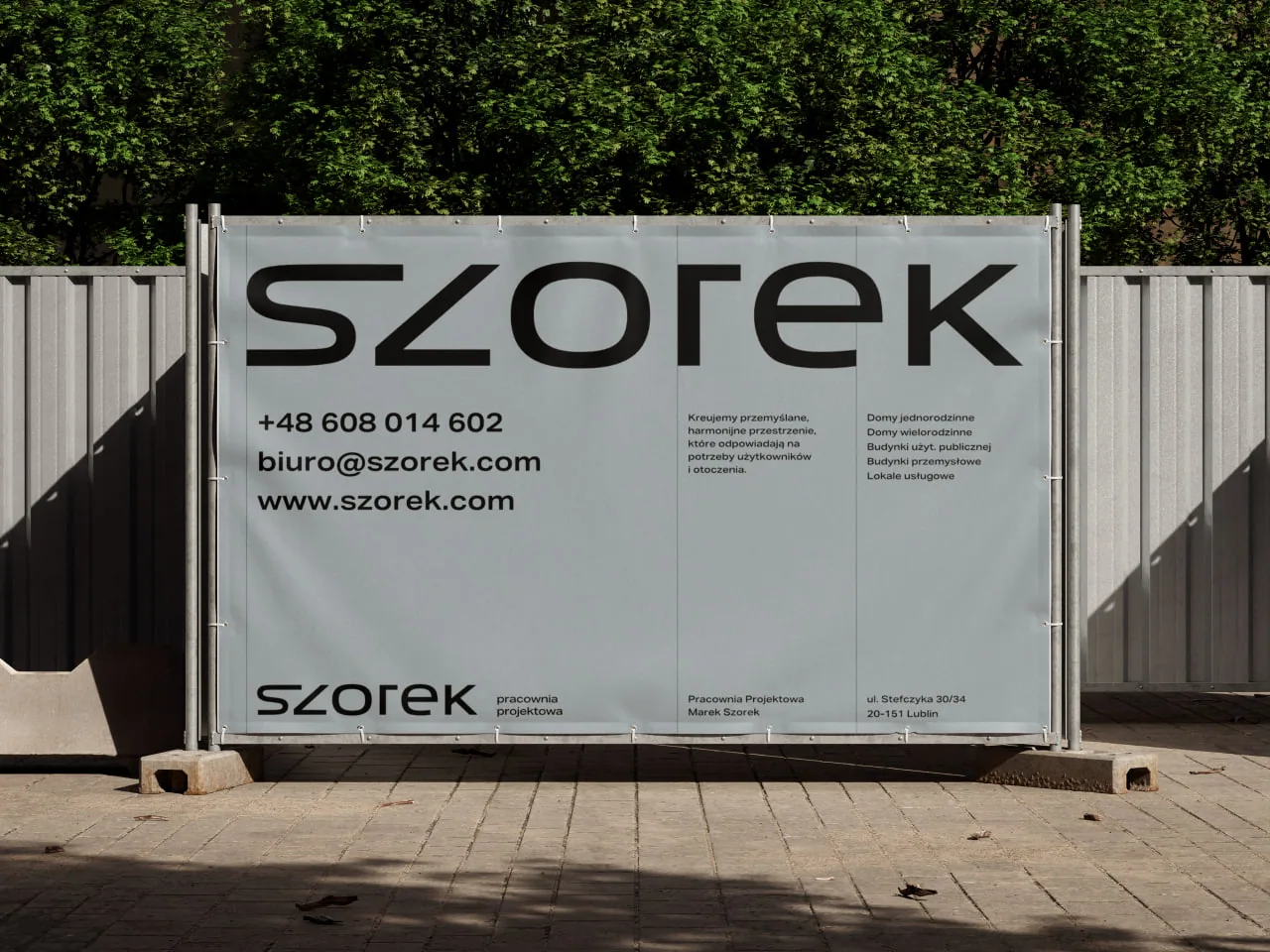
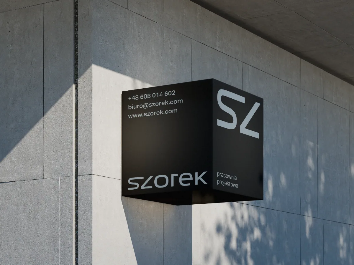
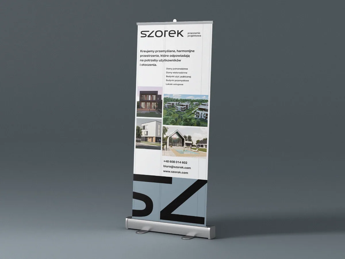
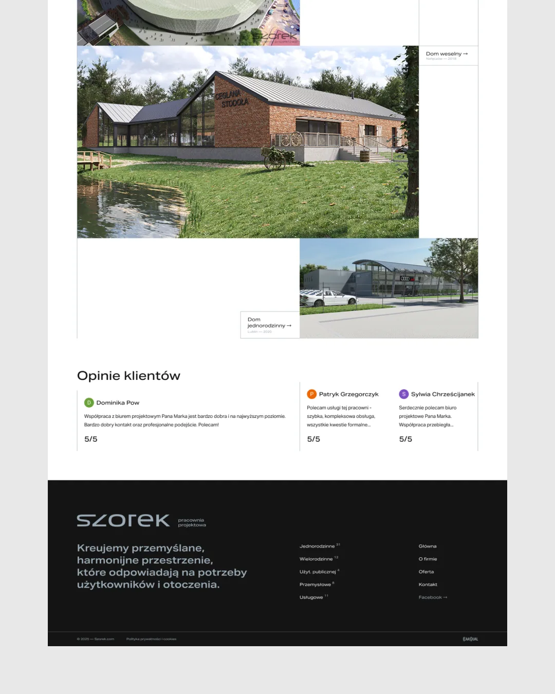
A system of linear elements inspired by technical drawing completes the identity. We carried it through to a new website, business cards, signage, a roll-up and construction site banners.
Result
The studio’s new website is live at szorek.com, and the brand looks consistent from the business card to the building site.