prepare design studio
Challenge
prepare design studio was our previous studio, run by a different team of three. It was CAASUAL’s trial by fire: it showed what works and what doesn’t.
It was more lifestyle than business. It gathered local cultural activity around it and documented events, graffiti, skate culture and the music scene. Its projects felt more like drops than client commissions.
What we did
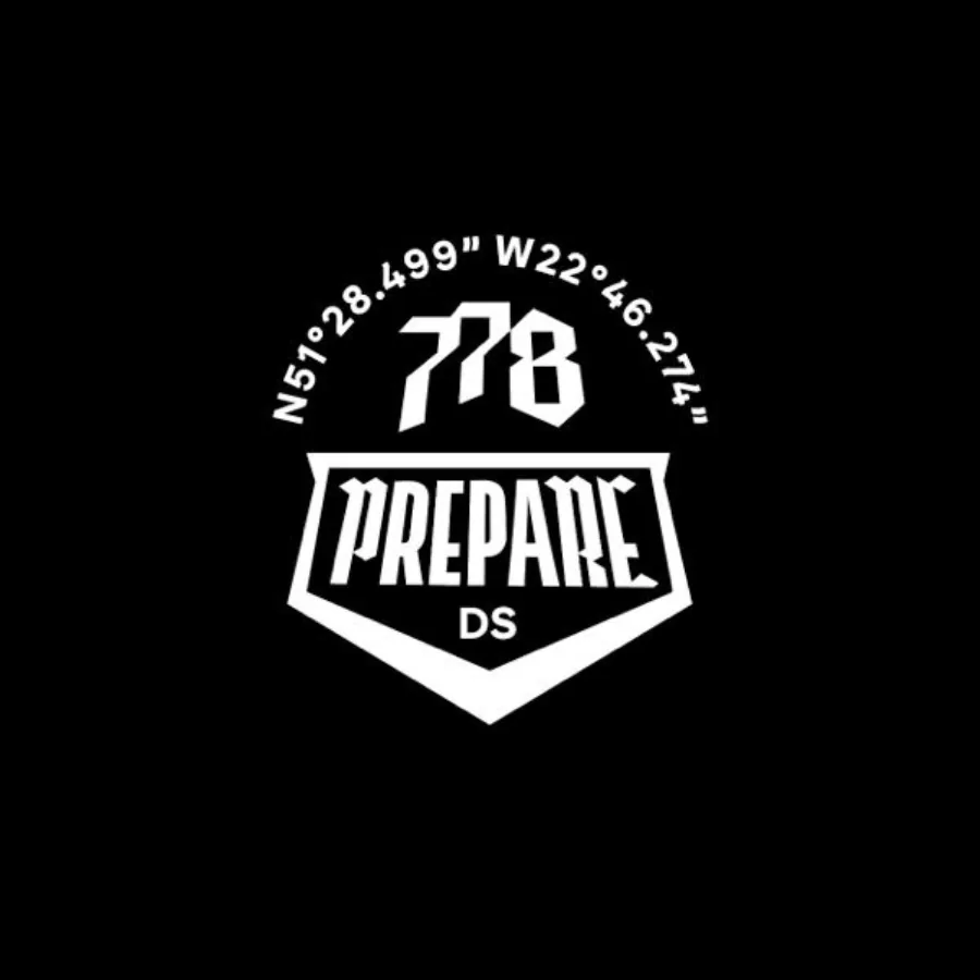
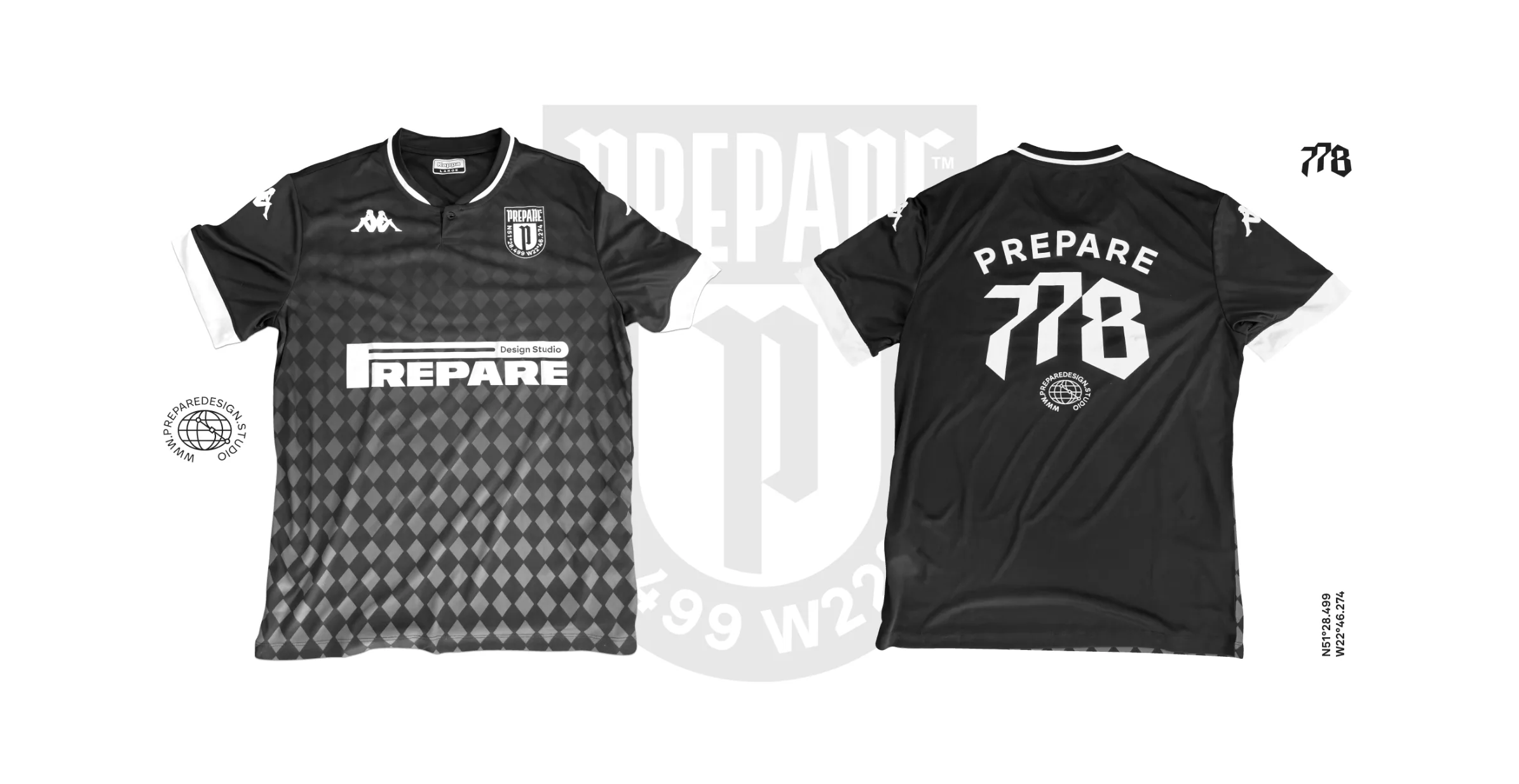

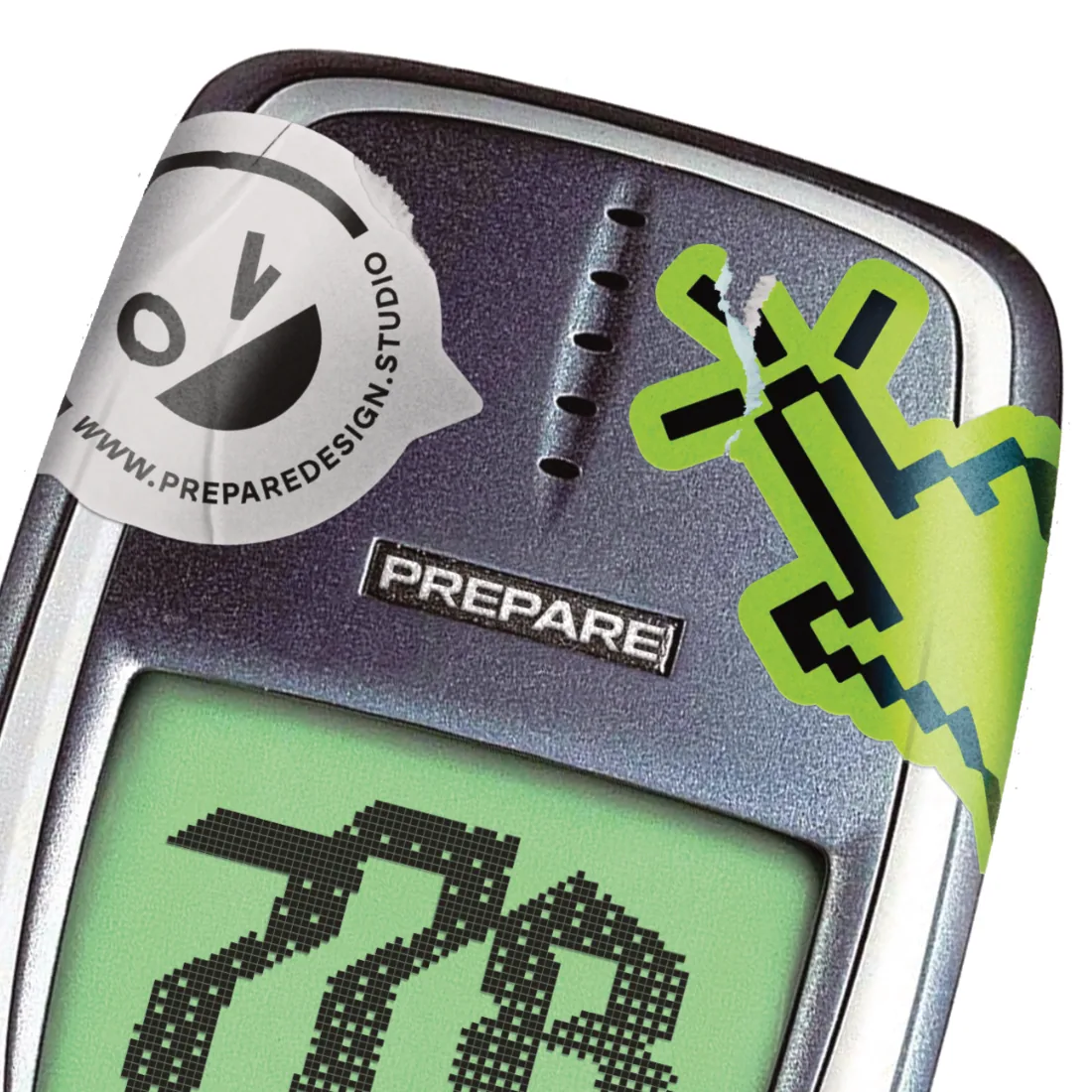
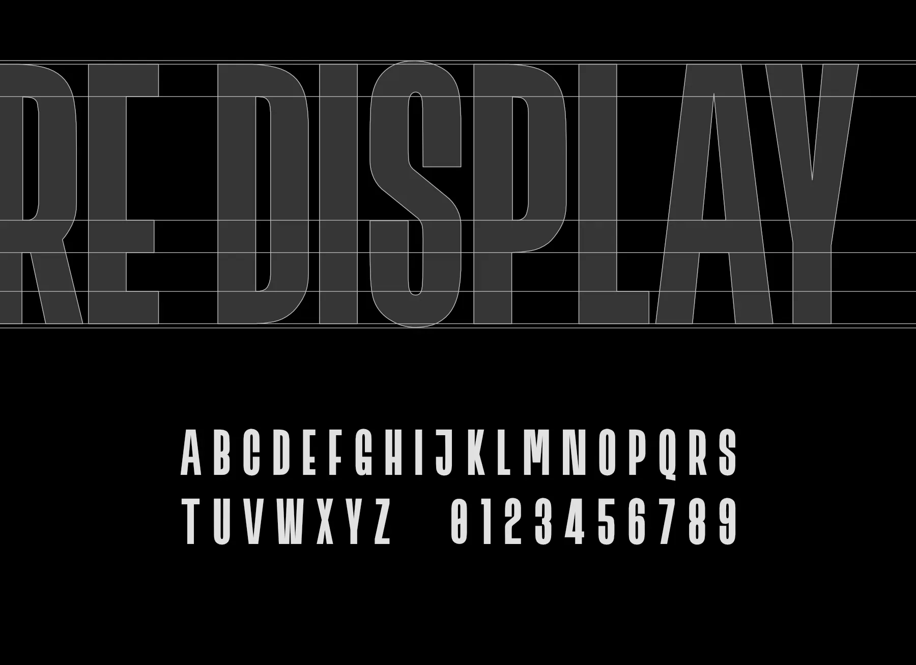
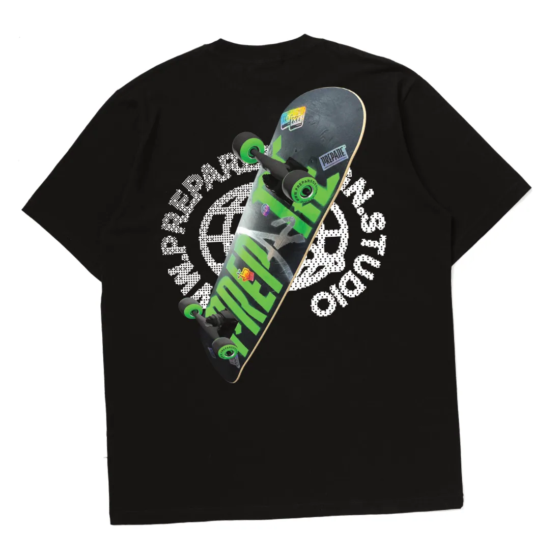
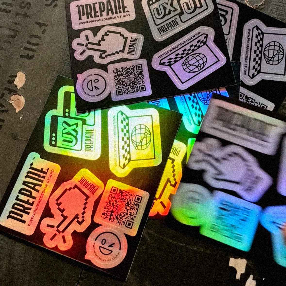
We based the logotype on a combination of two typefaces, set against each other with deliberate tension so it looked like lettering from a club crest. The number 778, taken from the office address at no. 77/8, became the studio’s badge together with its geographic coordinates. The visual language drew on early-2000s tech: a retro phone with a pixel display, cursor and smiley icons, a checkerboard and acid green.

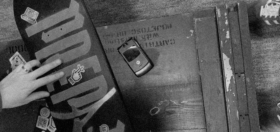
We carried the system onto football shirts, oversized T-shirts, a skateboard graphic, sticker cards and holographic QR-code sticker sheets. Merch people genuinely wanted to wear and collect, quietly saying: Level up, ditch the grind.
Result
Once the ideas had matured and been tested, prepare evolved into a full-fledged business: CAASUAL, with a new collaboration model and services.