BlueBee
Challenge
BlueBee is a B2B marketing and branding agency that grew for years mostly through referrals and long-standing clients. Its new strategy was to refresh the brand and win clients beyond that pool: companies bringing an offer to market or entering a new segment, who need go-to-market support.
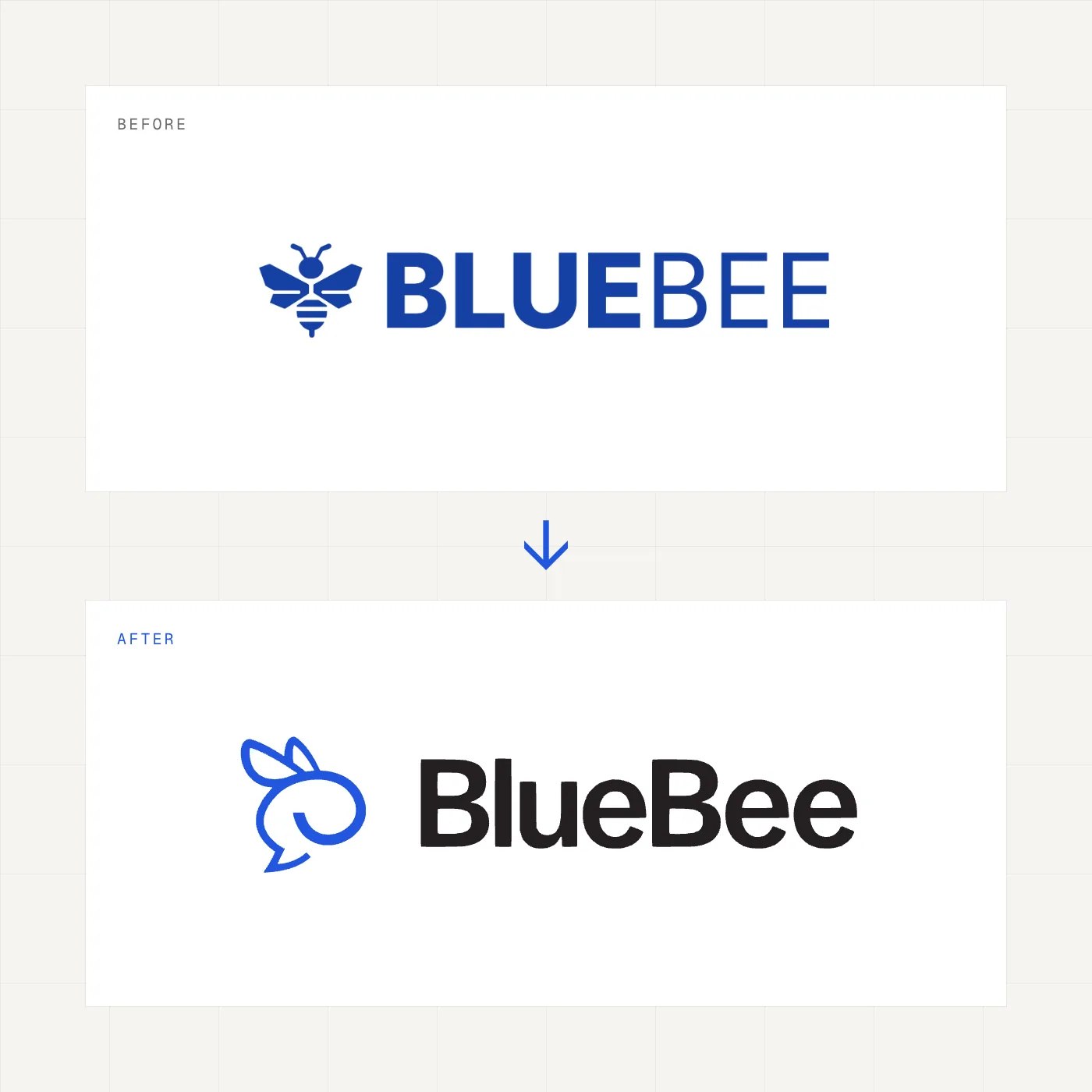
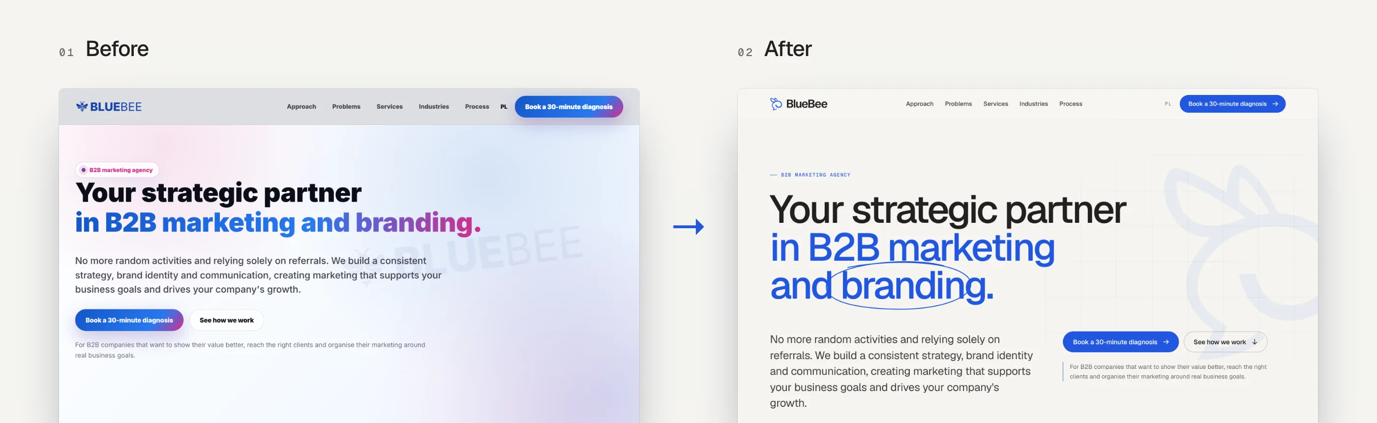
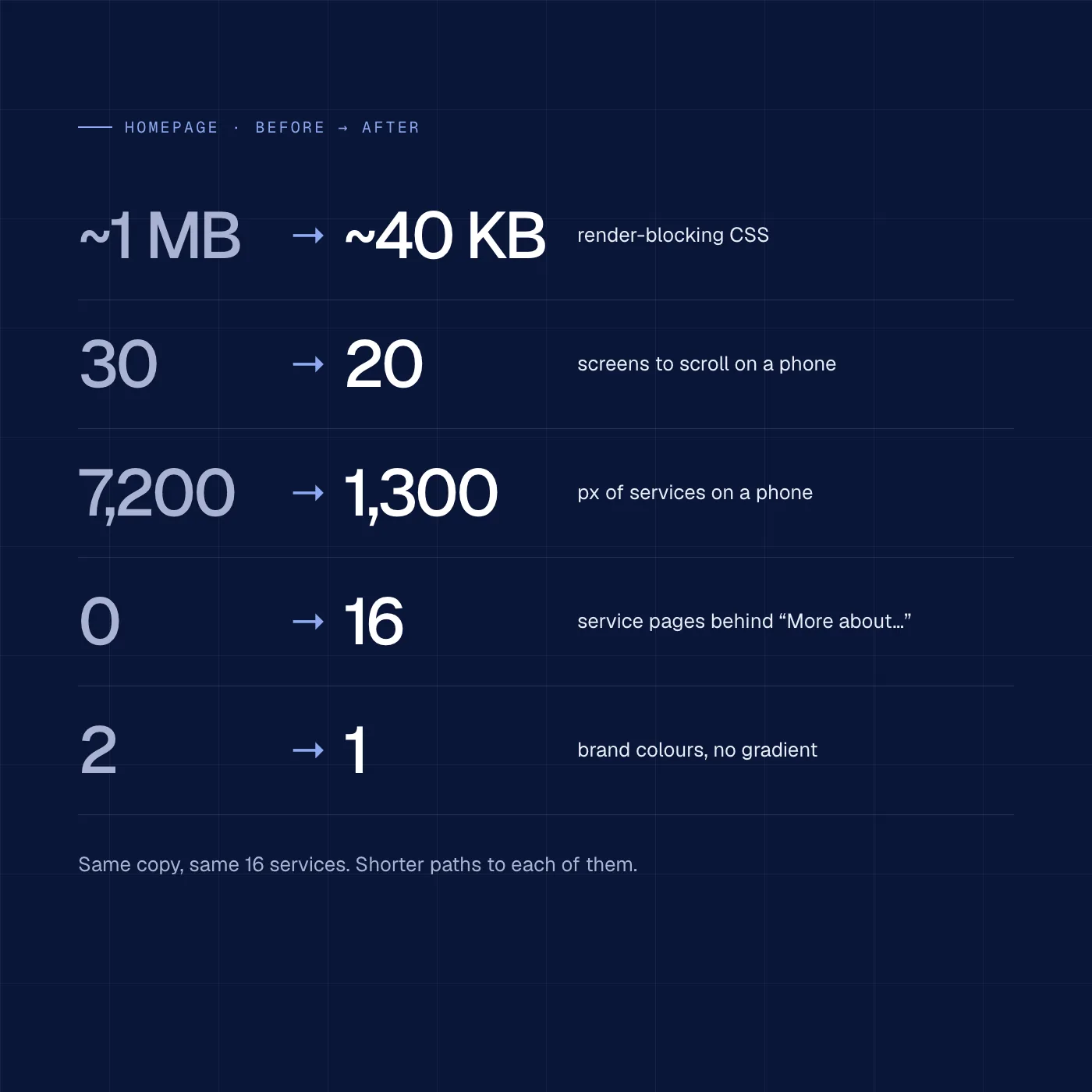
The existing brand did not support that. The logo was designed many years ago and had lost its relevance. The website was overloaded: about 30 screens on a phone, with the services section alone over 7,000 px long. Offer details were scattered across separate pages that few people reached. Some had been switched off, so 16 “More about…” links ended in the contact form. A blue-to-fuchsia gradient and about 1 MB of render-blocking CSS did not fit an agency that has to speak the language of specifics.
What we did
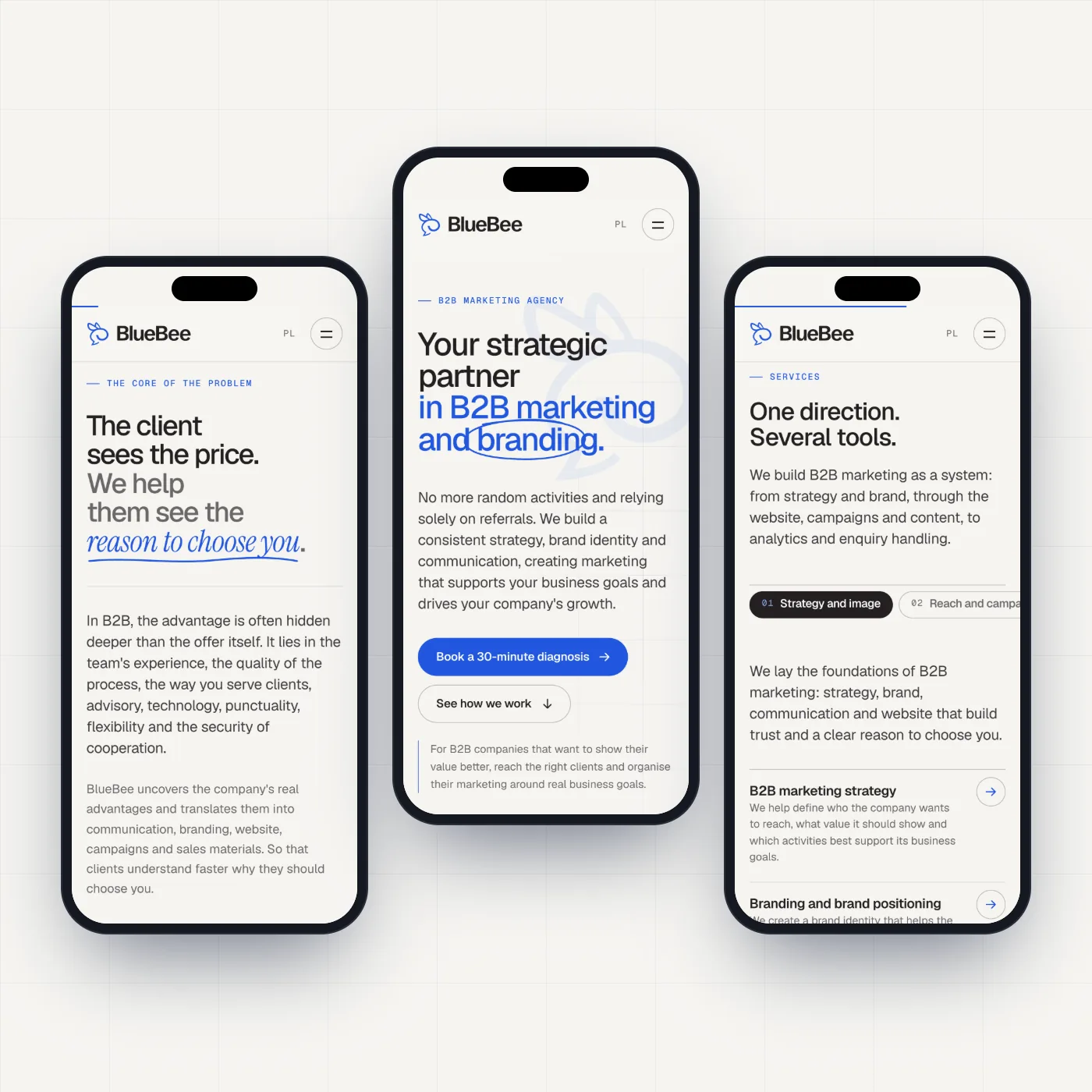
We started with a UI/UX audit and a design critique. We measured every section, ranked the problems by priority and set them against five market references. That gave us a moodboard and a direction: “engineering precision, the warmth of a conversation”.
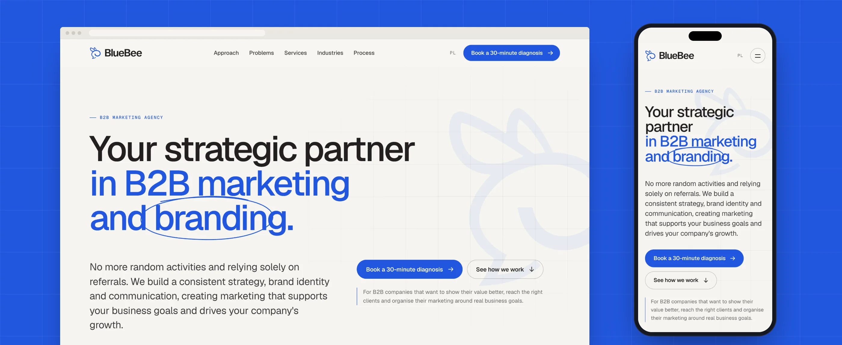
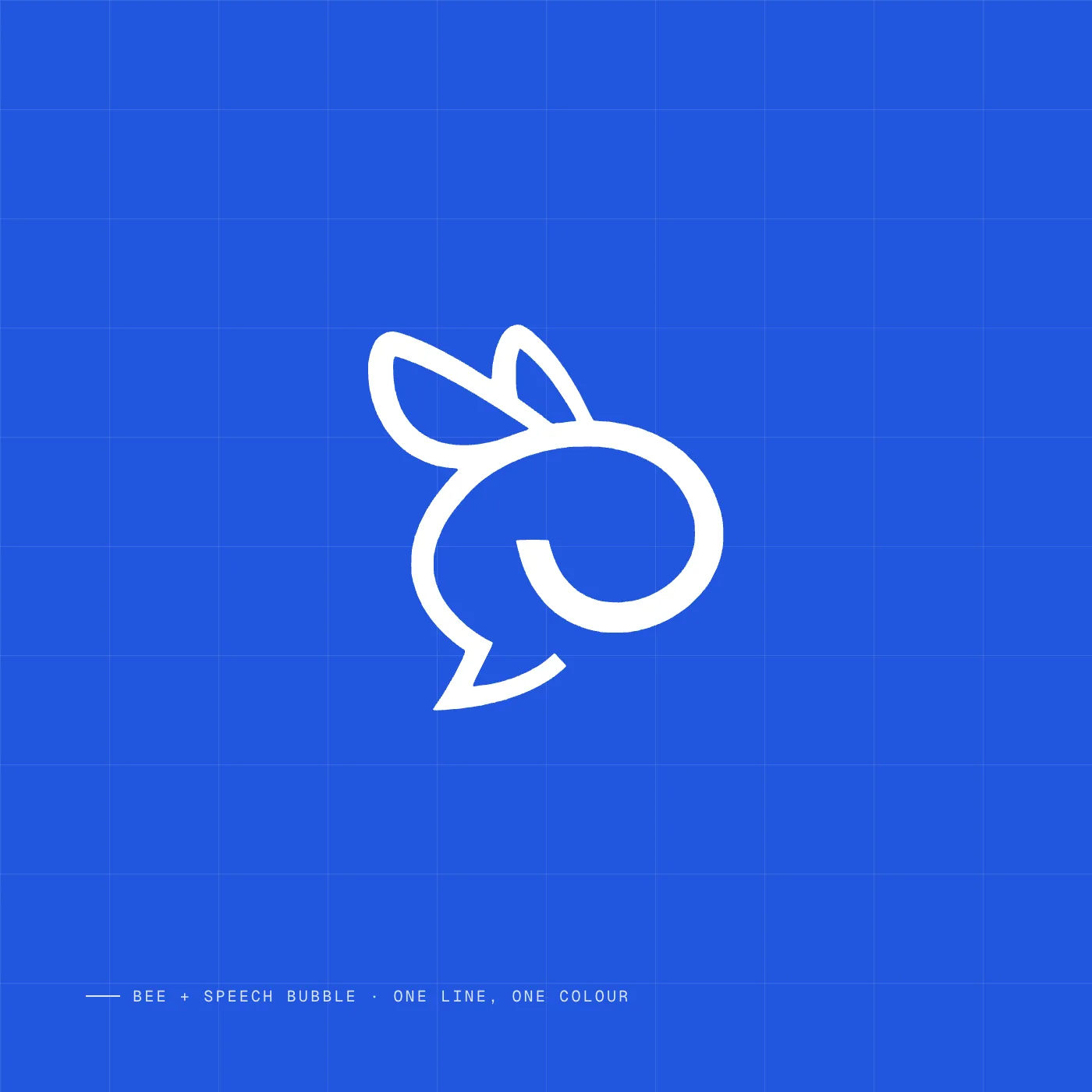
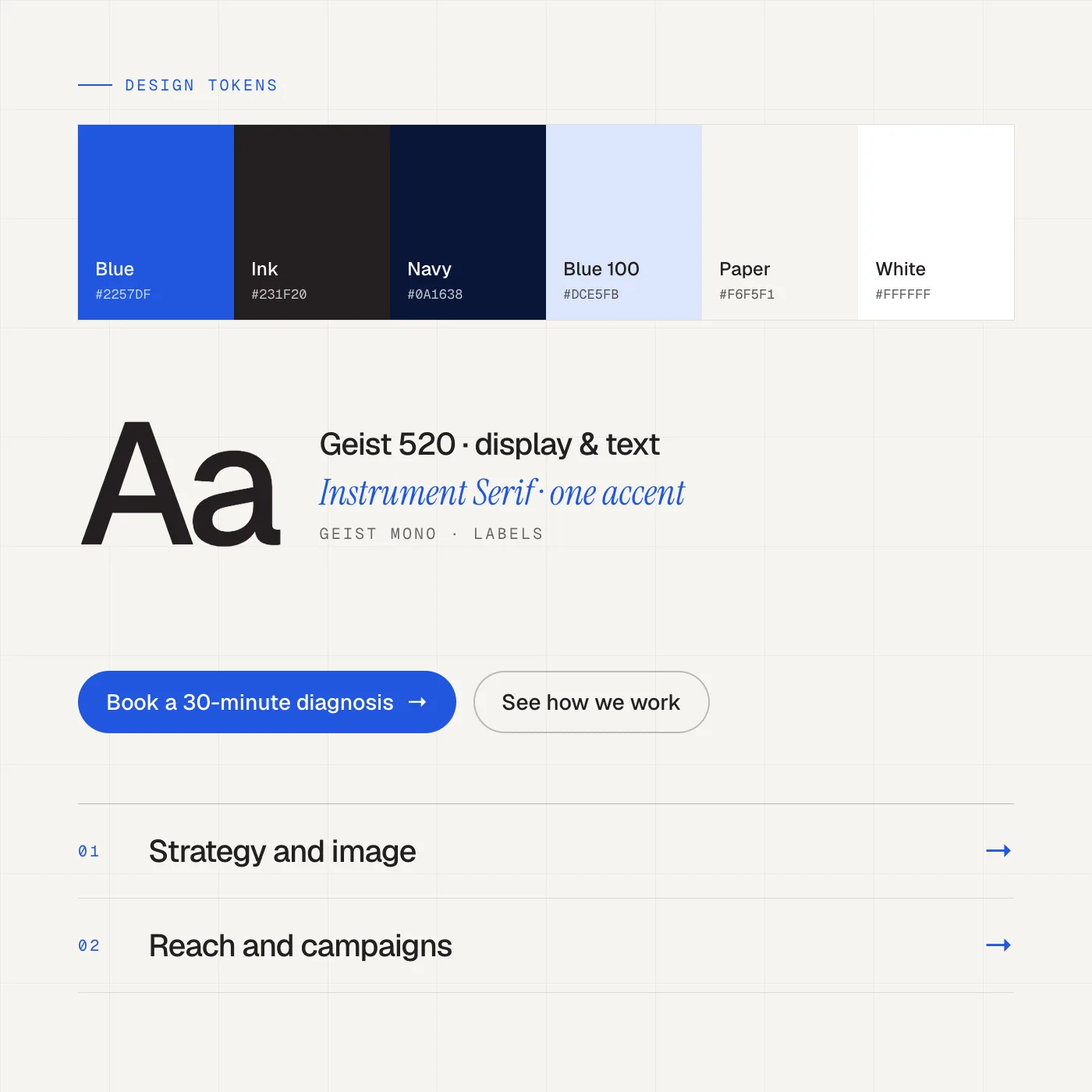
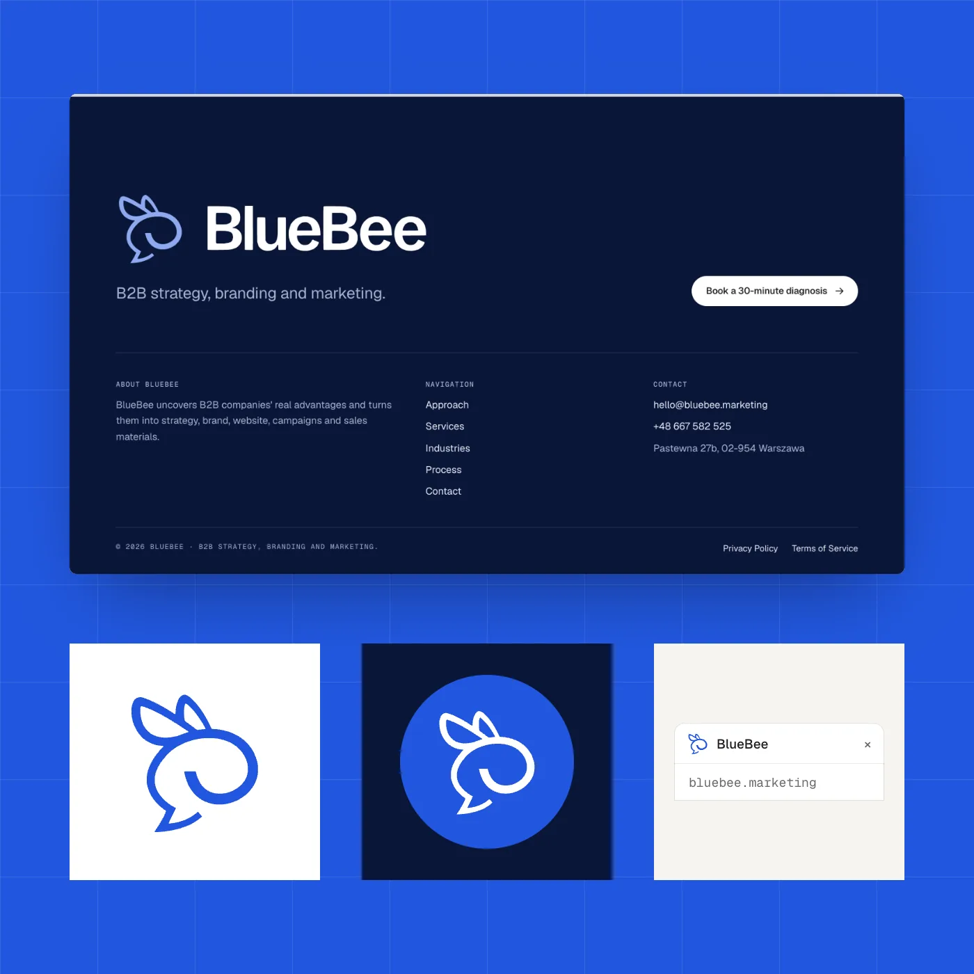
The new mark is a bee drawn in a single line that is also a speech bubble. It shows a partner who starts with a conversation, not a ready-made package. A lighter, startup-like character and one blue, #2257DF, are meant to speak to companies at the go-to-market stage. We built the whole system on the mark: the warm black of the wordmark, hairline grids instead of cards, Geist with a mono for labels and a single Instrument Serif accent.
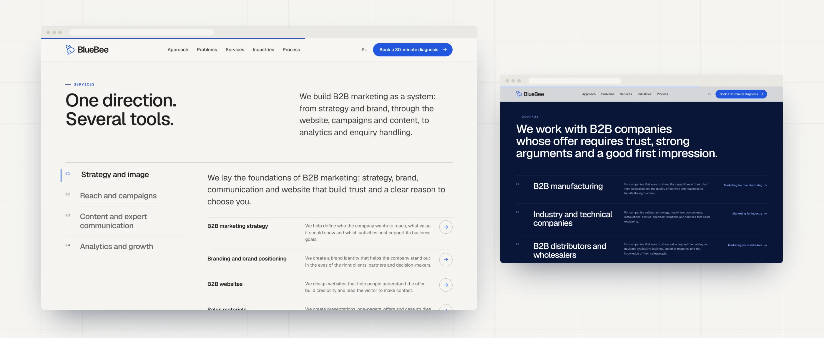
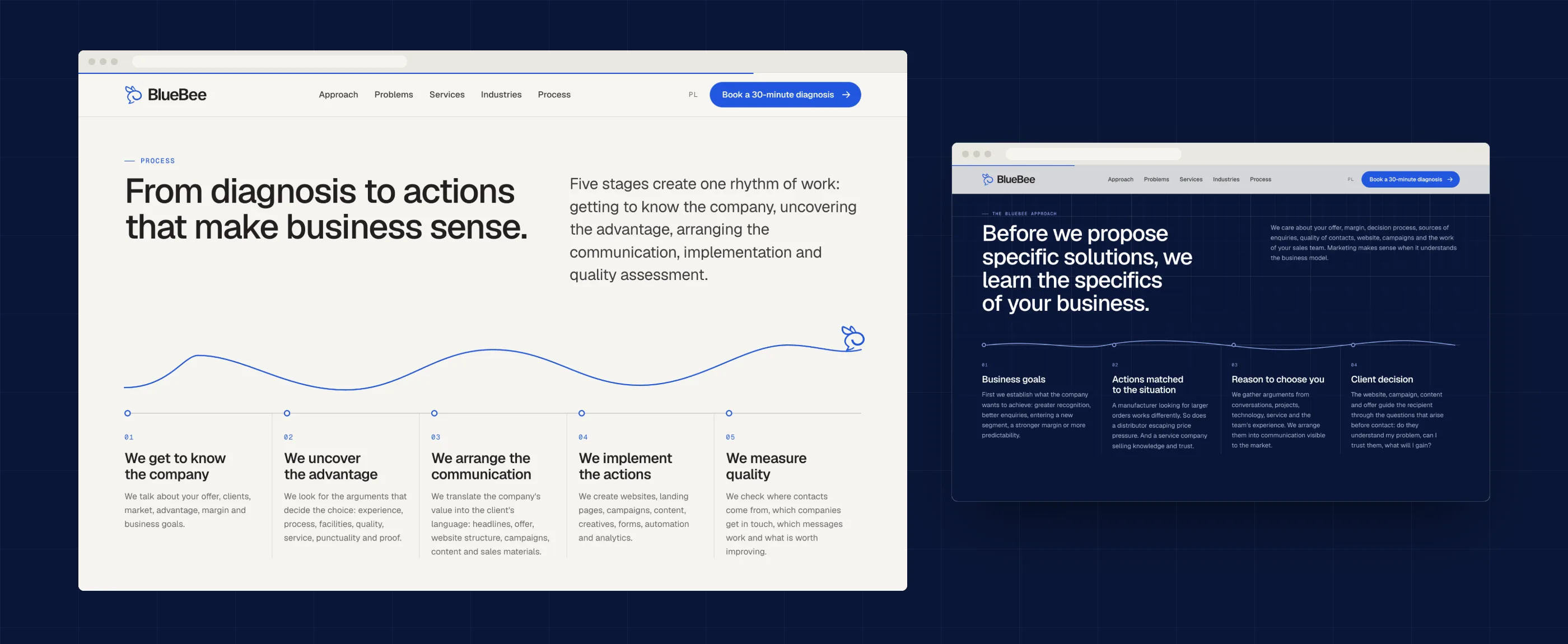
We kept the homepage copy as it was and rebuilt its form. Sixteen service cards became an index in 4 groups, and the carousel became a static sequence. The process follows the bee’s flight line. We added 16 service pages and a readable template for legal documents. We built the site as a static website in an AI design workflow, from the audit to the code.
Result
BlueBee has a consistent brand that looks like a strategic partner, not another agency with a gradient. Each of the 16 “More about…” links now leads to a service page, and every service is two clicks away: from the menu to the index, and from the index to its page. On a phone the site went from about 30 to 20 screens, and the services section from over 7,000 to about 1,300 px. Render-blocking CSS dropped from about 1 MB to about 40 KB, so the first screen loads faster, especially on phones.